Danmarks Nationalbank
Danmarks Nationalbank’s visual identity from the late 1990s reflected a traditional image of authority with dark blue colors, generic typefaces, and monochrome photos.
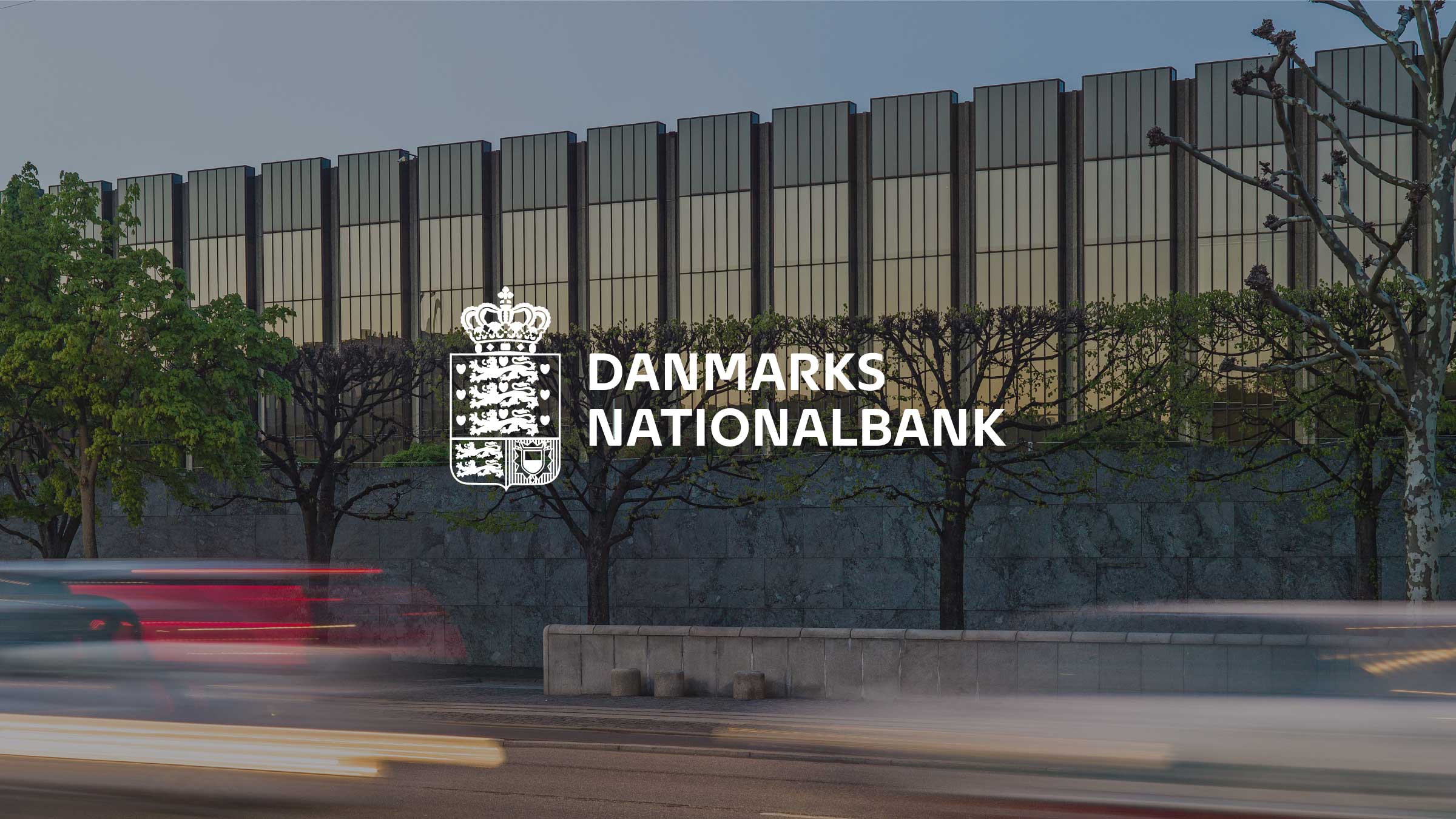
As society evolved towards modernity and transparency, I recognized the need for the bank’s identity to mirror these changes.
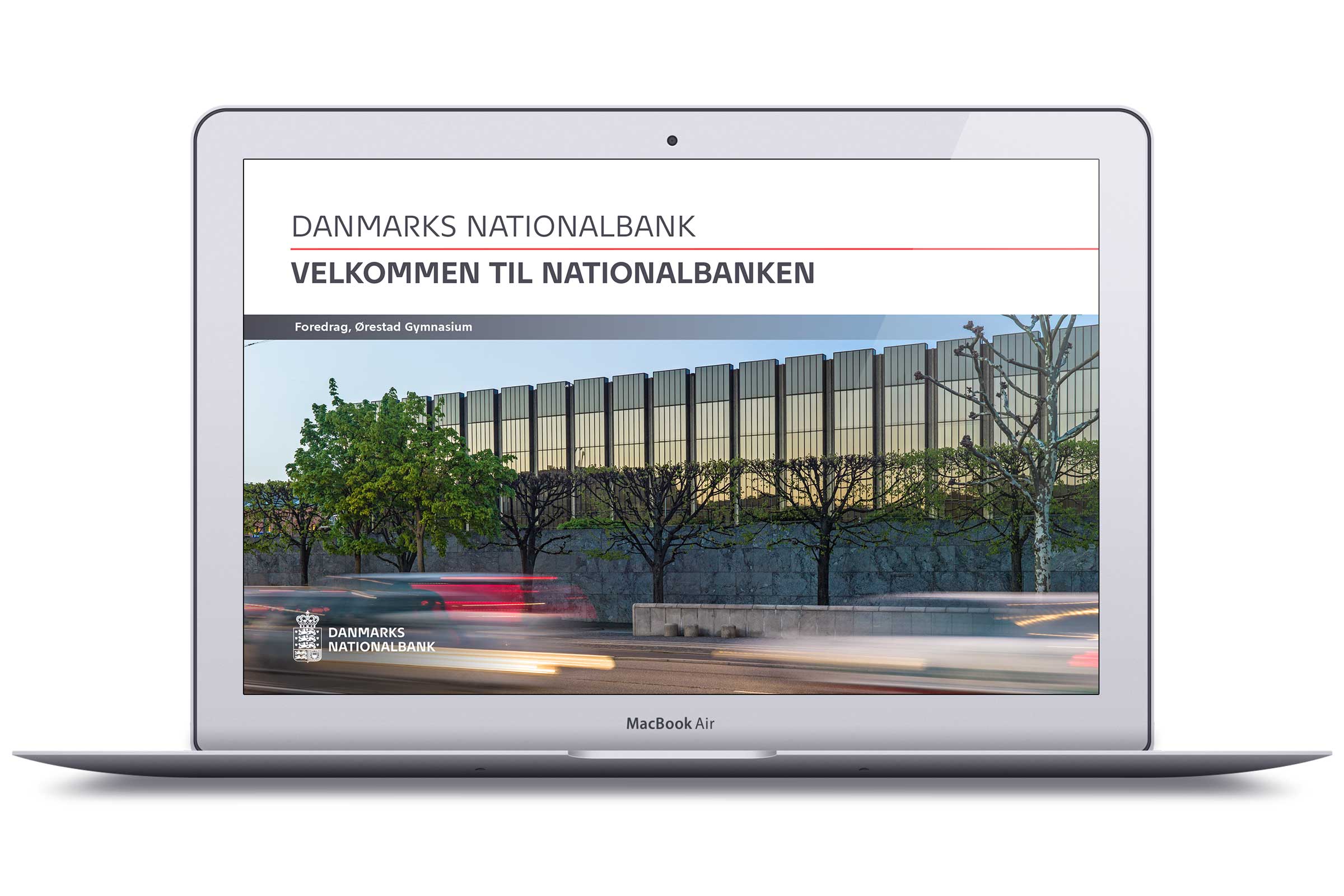
During my initial meeting with General Governor Nils Bernstein at Danmarks National Bank, I proposed a new visual identity better to represent the bank’s role in a modern economy. General Governor Bernstein supported this idea, leading to my development of a fresh visual identity. This involved creating a bespoke typeface, selecting specific colors, and adopting a distinct photo style, achieving a balance between the bank’s unique identity and its stature as a central bank.
The update to Danmarks Nationalbank’s visual identity was crucial for aligning with the bank’s new direction. The modernized identity helped the bank attract the right talent and maintain relevance in a changing world, effectively bridging the gap between its traditional image and contemporary aspirations.
Typeface
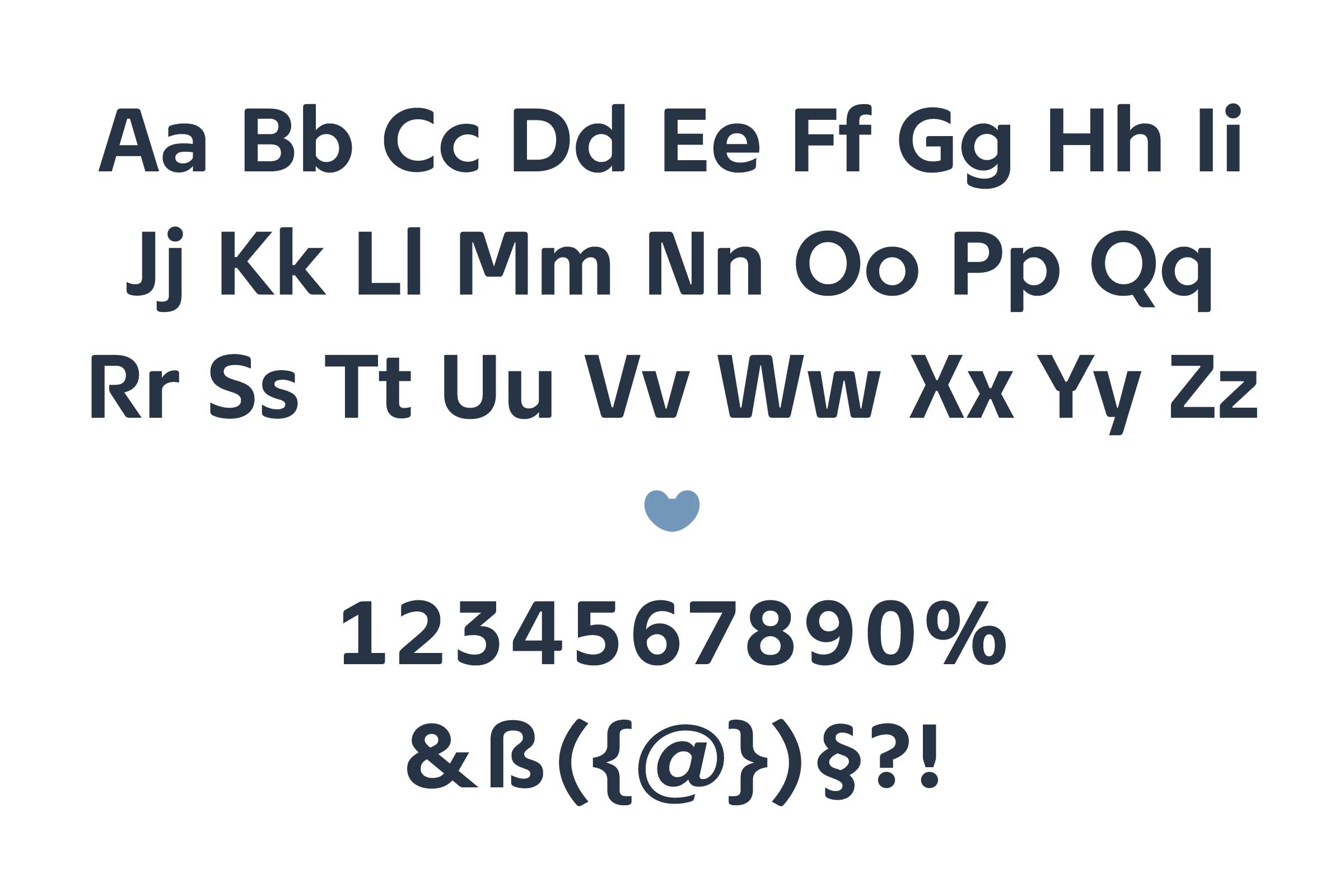
Designing a custom font inspired by Arne Jacobsen’s iconic Nationalbank Building seemed like a natural choice for the cornerstone of the bank’s new visual identity.
I developed the Nationalbank typeface, drawing inspiration from Arne Jacobsen’s iconic architectural design and the Danish typographic tradition. This typeface was crafted to be highly readable in small sizes, revealing intricate details when used in larger scales. I paid particular attention to the clarity of numbers, ensuring they are optimal for financial documents.
Furthermore, my goal was to give the typeface a contemporary feel, aligning with the modern ethos of a central bank.

